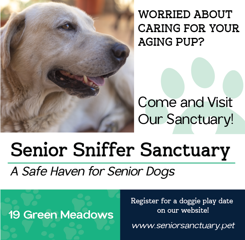
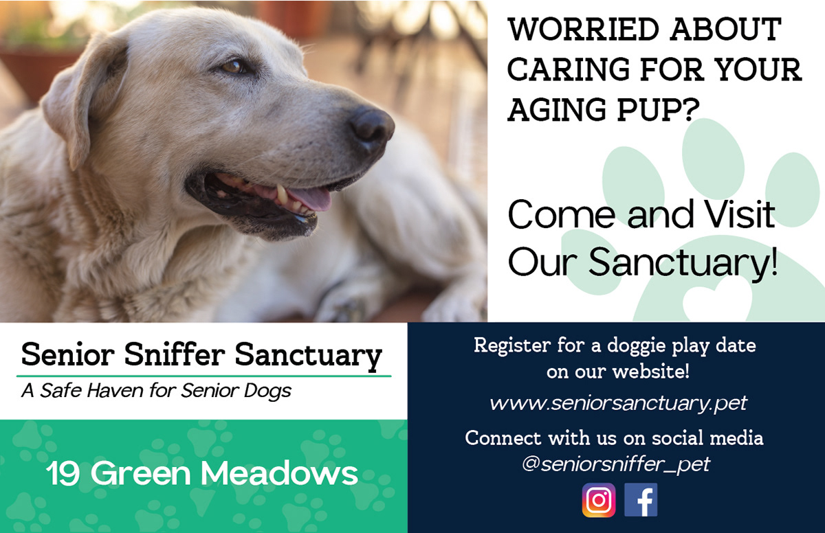
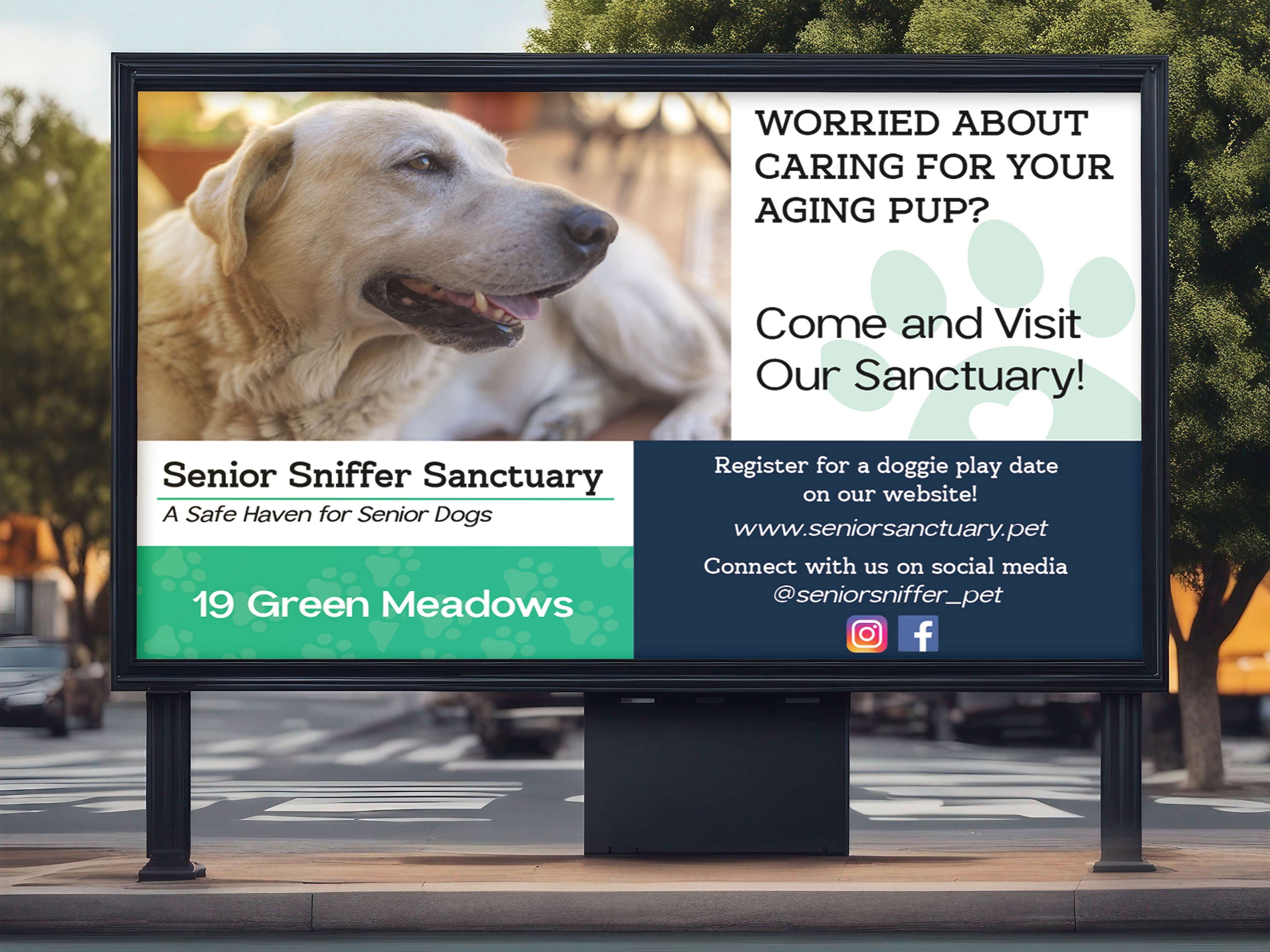
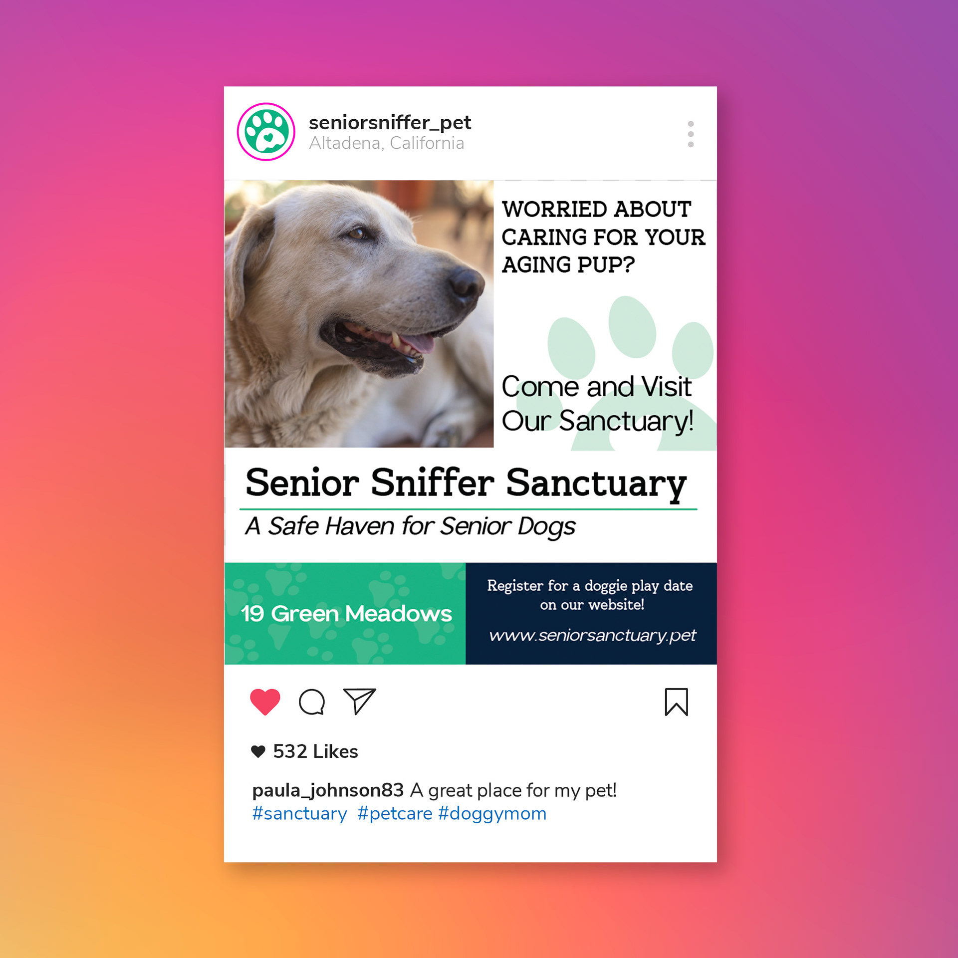
THE INTRODUCTION
This project was created during a class that was teaching the fundamentals of design. In this class, we had a choice between two companies to make a design for. I decided to choose a dog sanctuary to get more familiar designing with non-profits. Our goal was to make a design that was effective at condensing information and enticing consumers to interact with the product. We were provided a design brief that had the company's colors, a mission statement, and details about registering, the company, and where to find them.
THE CONCEPT
The first concept that I came up with was mostly about understanding how the colors would interact with each other and how the hiearchy would work. I was having trouble to putting all the information into a design that was not only cohesive but legible. I wanted the design to flow in a natural direction. This initial concept made me realize that most of my designs (up to that point in this particular class) was a bit too rigid when it came to alignment. I didn't play around with it and typically stuck to a middle or left alignment.
![](https://cdn.myportfolio.com/bf307236-c853-4c8d-a48f-4749b22f513a/7c9c3f9a-6960-44e1-a119-3b6948b441d6_rw_1200.png?h=6baba6827227e74df1c73f5f6432ad18)
Wanting to break free from that, I researched other ways to manipulate alignment and the general hierarchy of a design. I felt that grids were an easy way to read information while giving each of the elements enough room to breathe. I also wanted to change the tone of the design. I felt that I had leaned too heavily on a playful tone and wanted to invoke a senes of security. I decided that the dark blue would be more suitable as the primary color while the green acts as more of an accent. I was able to layout each of the elements in a way that felt more visually appealing.
![](https://cdn.myportfolio.com/bf307236-c853-4c8d-a48f-4749b22f513a/87d62b0c-aa3c-406b-8af3-a3ac89287745_rw_1200.png?h=c111dbaec55f0d51215ba799d2395315)
![](https://cdn.myportfolio.com/bf307236-c853-4c8d-a48f-4749b22f513a/4c8dda48-ef4e-4a0d-a3ea-4af23dd53428_rw_1920.jpg?h=52644f7574a9fd39cbc664325cfae74c)
![](https://cdn.myportfolio.com/bf307236-c853-4c8d-a48f-4749b22f513a/100d0c6b-4eb8-4b7a-ab6e-2acdb392621c_rw_1200.jpg?h=76d53e345b8784478625359c9296adbc)
THE REFLECTION
The main takeaway that I have from this project is the importance of considering how information flows in a design. I believe that the first concept could work, but I would need to change the font that surrounds the dog and consider a more exciting way to present this information to have a more consistent tone. I would actually change the image that I chose in my second iteration to still keep that playfulness. I feel that the text and clean aesthetic gives the design enough maturity to be taken seriously.