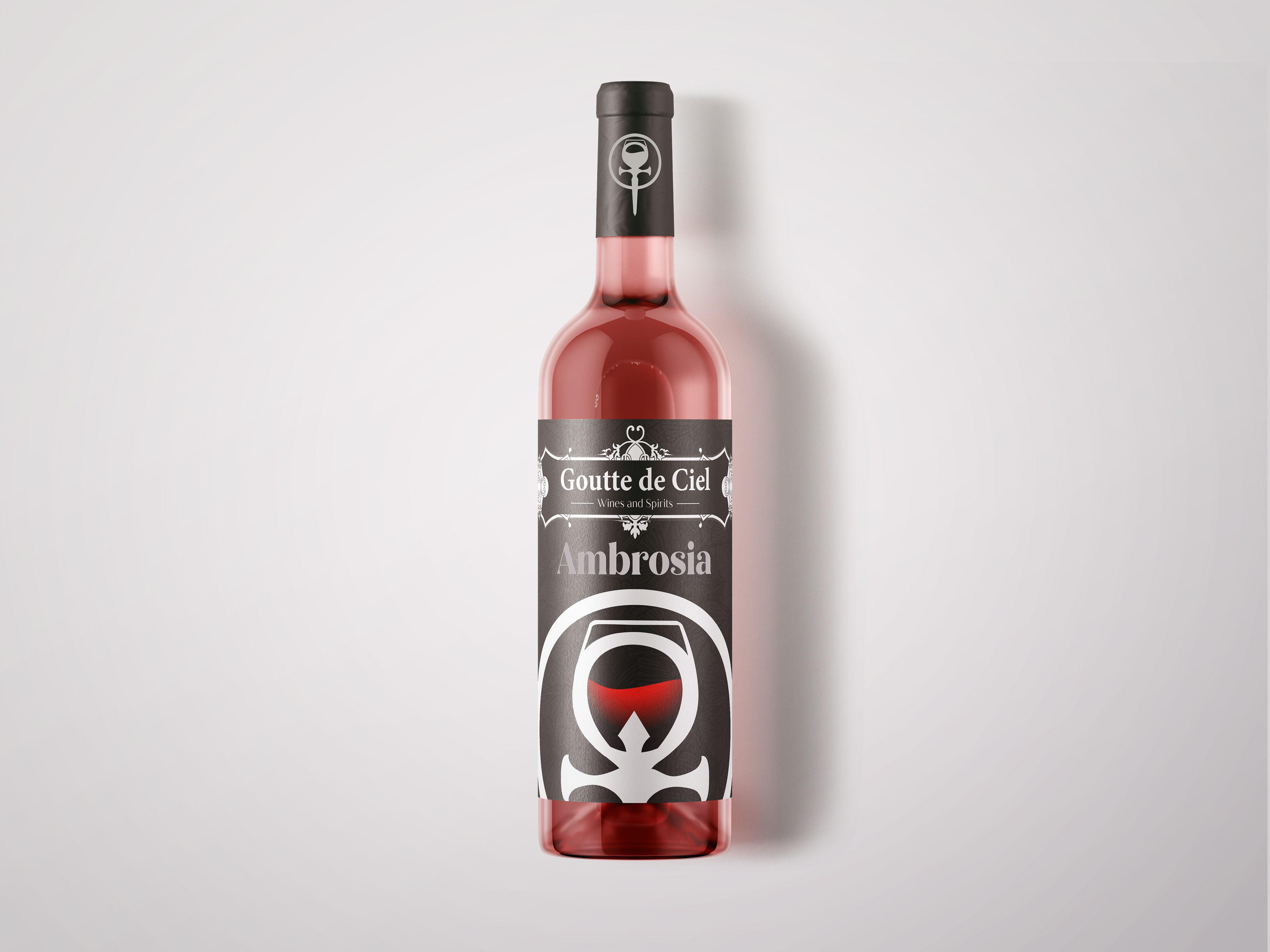
The Background
As a hobby, I play a lot of tabletop games and even run a few D&D sessions. Immersion is an essential thing when it comes to roleplaying and I wanted to help my friend to create an immersive world with products that could show the societal changes that an event had in a world like our own. The difference? Vampires have become most of the population and now we must figure out how to coexist with them. This campaign was heavily inspired by the indie movie, Afflicted. It was directed by Derek Lee and Clif Prowse, and they are the main stars of the movie. To keep the synopsis brief, it's about two best friends who travel the world because Derek was diagnosed with a deadly condition. It's during this journey that they have a run in with a vampire and Derek becomes afflicted with vampirism.
In one of the acts of the film, Derek and Clif visit a vineyard and this is where Derek snaps and leans into his full vampirism. It was this scene where I came up with the idea to create a company within my friend's world to show how much power vampires have garnered within this alternate society. 

The Inspiration
When brainstorming the concept of the company, I wanted to consider its origins and purpose. Why sell wine and what makes them stand out from the other competitors? Because this was a supernatural setting, I felt it was best to have a supernatural answer: vampire blood. The effects of it were meant to give a human a taste of what vampirism could be like and show that vampires were regal and graceful creatures. I wanted a symbol that could capture that regalness but also give off a sense of temptation. I researched various vampire symbology and attempted to combine some of them.

Most of the iterations were awkward and didn't give off the vibe that I wanted. However, there was one symbol that I noticed was consistent throughout vampire mythology: the ankh. 

Catherine Deneuve playing as Miriam Blaylock in The Hunger (1983)

If the picture above looked familiar, that's because it's from the 1983 film, The Hunger. The first stylized iteration of the ankh was shown with a necklace that appeared in the film. Though its design had a hidden dagger that lay within. Most references to the ankh in pop culture is due to this film and became the inspiration for the design that I wanted to move forward with.
The Finishing Touches
I wanted to keep the design simple, but I wanted to push myself a bit and consider how the company would rebrand over the decades that they would make their footprint in the wine making business. I decided to use this opportunity to reflect on how designs have changed over the years and companies feel the need to make that change. To break it down, I considered what the target audience would be for each year.

For the 2010s, I wanted the brand to be less of a luxury brand and more something akin to cheap wine you would buy with your friends on a Saturday night. A brand that would target the 20 somethings but the design of it to still be considered "luxury". The 2010s were very reminiscent of the hipster era and the beginning of Instagram so my font choices were a lot more playful.
For the 2020s, the brand would lean more into minimalism and try to up the age of their target audience. The packaging would focus more on the symbology and less on the general name of the brand, allowing the fullness of the "wine glass" and circle shape to catch the interest of the consumer. I assumed around this point; the company would be well known so the symbology would be a good enough indicator with the actual words acting as contextual support.
Finally, the 2030s would stick with the simple look but emphasize both the symbology and the name of the company. I'm not sure if in the 2030s the layout would be considered "retro”, but I wanted it to have a dated look that would stand out from its competitors to show that they are "sticking to the simpler times".

The Reflection
When taking on this project, I didn't really set any expectations for myself on how in depth I wanted to be about the history of the company. Most of my design decisions were based on small, inconsequential snippets from a 2010s movie that I thought was cool. It was an interesting way to learn about branding and how much thought goes into it. Customer feedback and understanding your target audience are essential parts of branding and I didn't really have anything to go from. If I were to revisit this project, I would start by creating a more in-depth design brief about the company and their expectations. This was also the first project that I used mockups for, and it was interesting to learn how to manipulate a premade mockup and how different things can look when they are on a package. 

Back to Top