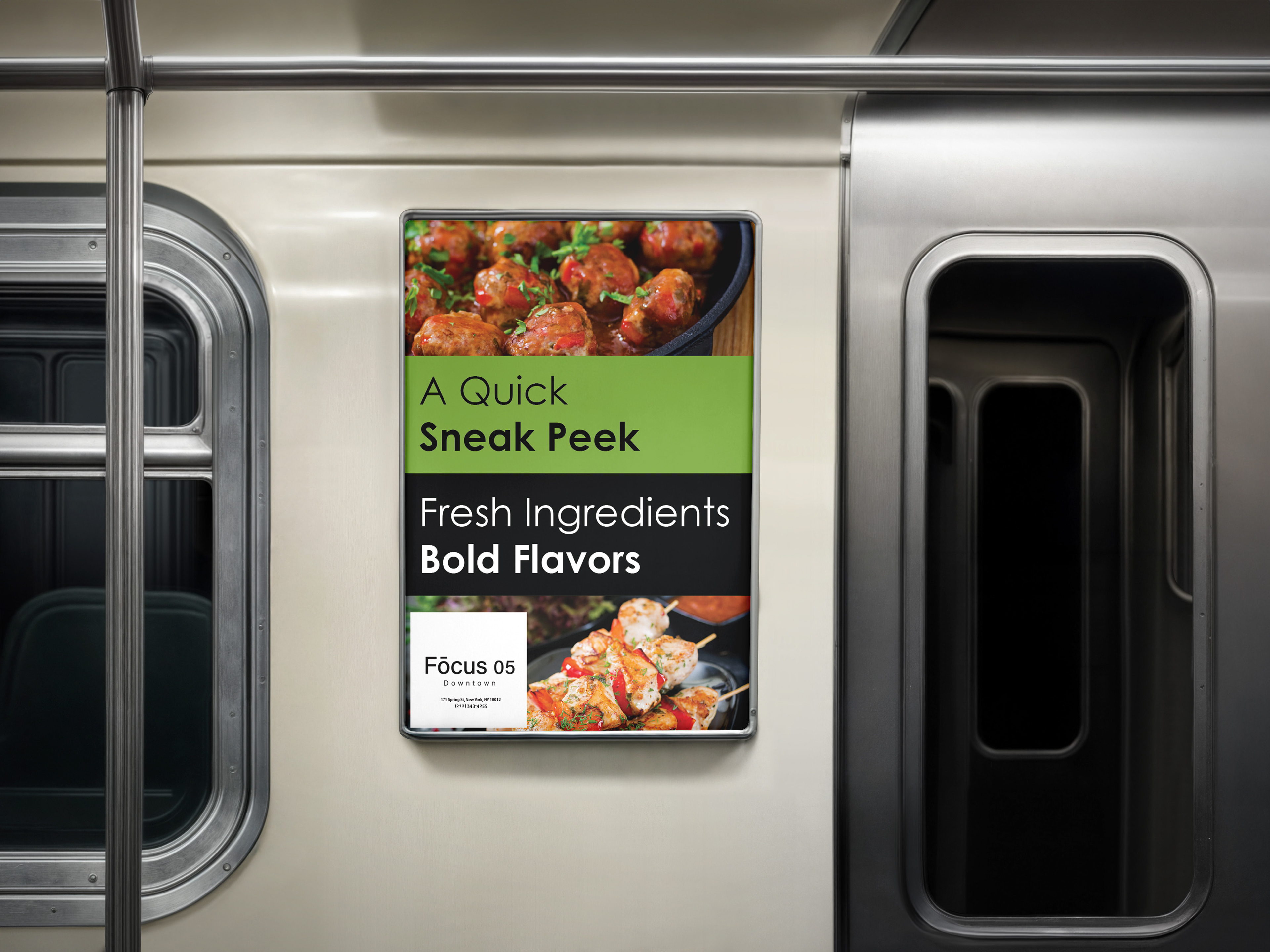
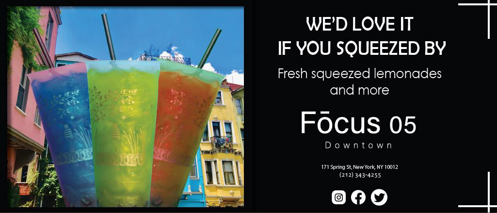
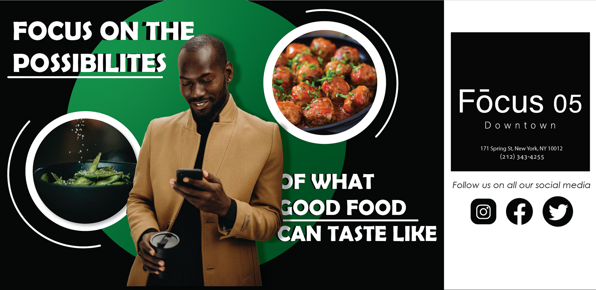
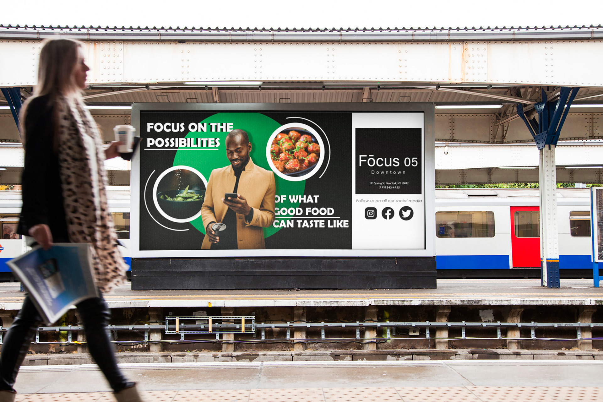
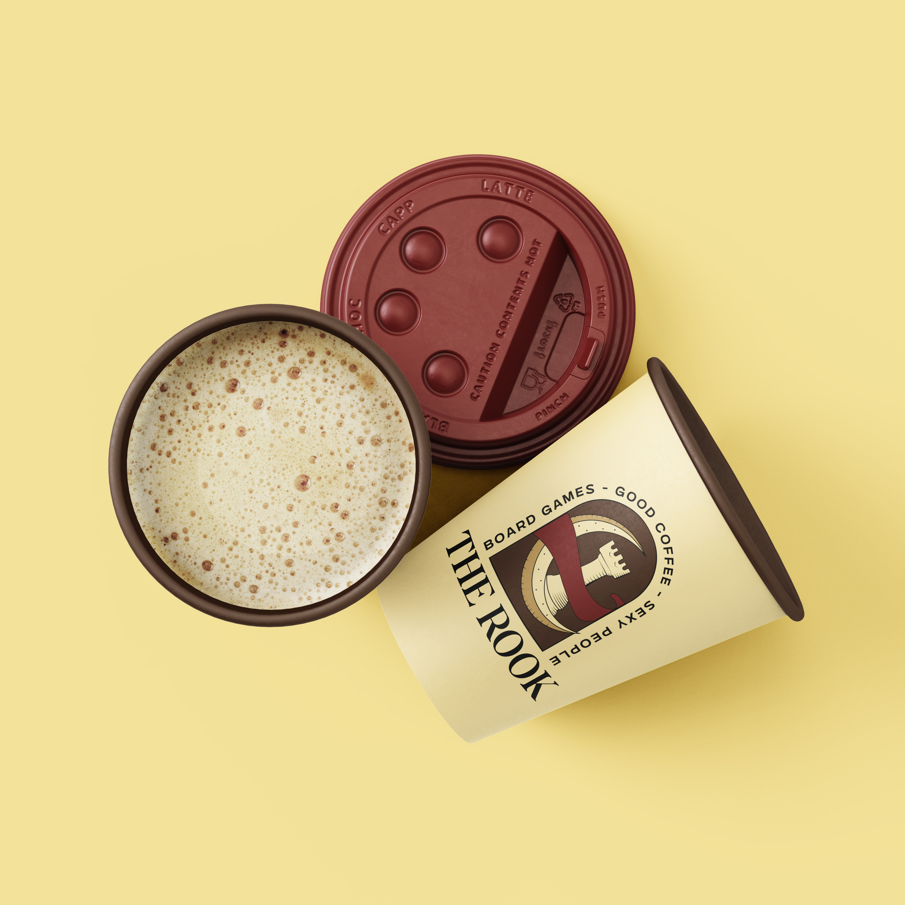
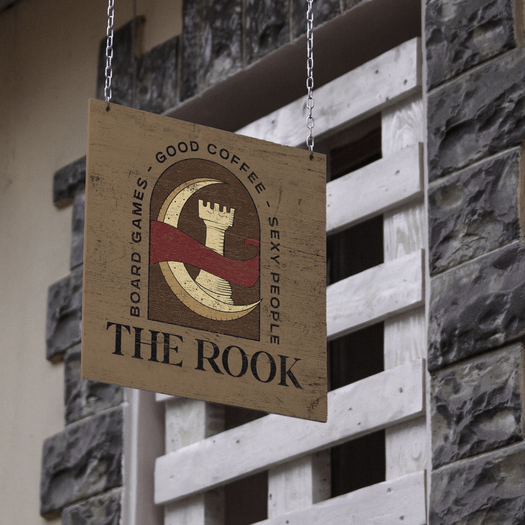
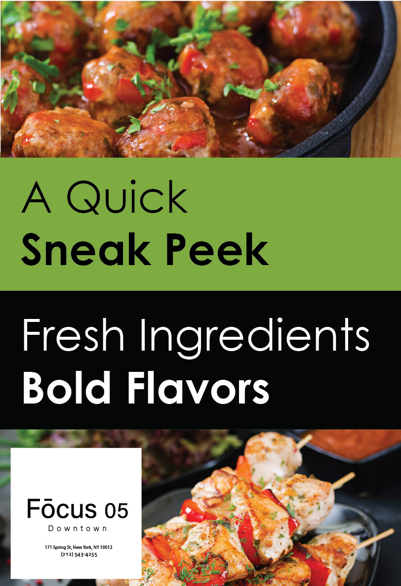
The Introduction
For this project, my class was learning the fundamentals of graphic design. Throughout the course of the week, we used Photoshop and Illustrator to create a brand identity for a restuarant based in a metropolitan. On this project, I wanted to focus on contrast, shape, color, and hierarchy. While we did cover a range of many fundamentals of design, I wanted to focus on those four concepts the most because I felt that it would allow me to create a more minimalist design to account for legibility. The colors were provided by the restaurant in the design brief that we were given but I needed to find a way to use them effectively. It was essential that the advertisement could be used in a subway station.
The Concepts
For the first concept, I wanted to focus on those colors to create emphasis on the words. I created a pattern to give the design more contrast and chose pictures that were bold and simple. The vibrant colors from the food contrast well with the stark, darker nature of the typography and its background. ​​​​​​​
For the second concept, I wanted to learn more about the minimalist approach that I was conceptualizing at the beginning of the project. With this concept, I wanted to put more emphasis on the actual products that the restaurant would offer. I kept the typography and colors of most of the design to be simple and then created a little window to put even more emphasis on the imagery.
For the last concept, I wanted to combine what I had done so far and add more concepts of the fundamentals. I wanted to try to incorporate lines to create a sense of energetic movement and emphasis. I decided to go for a simpler background but added a bit of color to center the audience’s eyes on the model, more particularly the expression on his face. I used my understanding of contrast to create the text around the model and attempted to create a sense of depth by adding a shadow on the model.
The Reflection
Looking back on this project, I realize how important formatting and smaller details can be when doing design work. Some of the images that I used can appear blurry and some of the masking that I did was less refined, but the ideas behind each of my concepts allowed me to get a gist of the most important factors of what can make a good design. I definitely believe that I can continue to elevate these concepts and play around with basics.
Back to Top